An eye-catching logo can become part of the collective unconscious due to a powerful image it features or a feeling it invokes. Striking the right marketing chord with the design depends on the chosen font, which can either enhance or hinder your message. Let the following tips help you decide on a winning font that contributes to brand awareness.
How to Pick the Right Font for Your Logo
1. Think About Brand Identity
The right font complements the products or services you sell. For example, if you make children’s toys and books, comic-style fonts will match the brand's aesthetic.
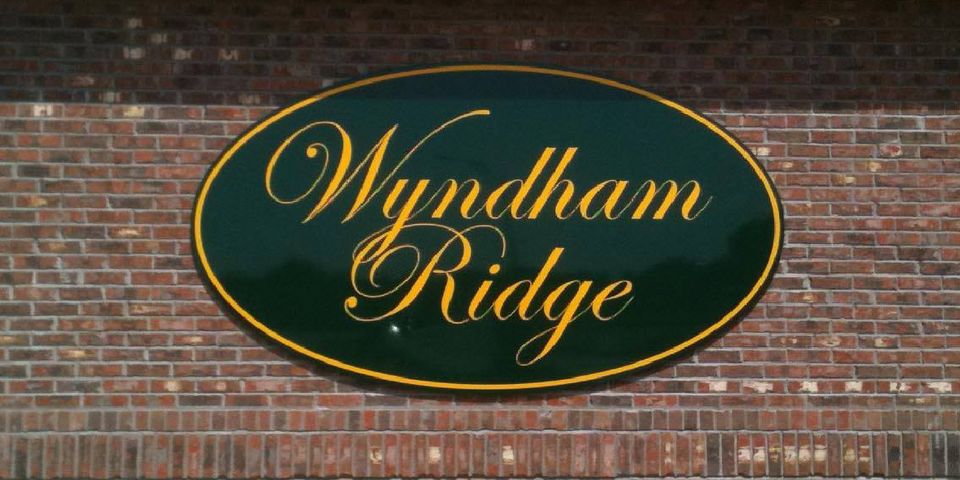
Conversely, script typefaces can be difficult for children to read because of their elaborate designs. The elegance and sophistication of these fonts are better for businesses that cater to adults, including salons, clothing boutiques, and upscale restaurants.
Consider writing down the words you want associated with your business to help you choose a font. If you want to establish a formal or traditional reputation, consider a serif typeface with thin, straight lines. For a more carefree effect, choose bold lettering with curves and playful accents.
2. Ensure Readability

Your font must be legible to your target audience, especially when they have seconds to read the sign because they’re driving. Clean, embellishment-free fonts typically work best, including those under the san serif umbrella.
These fonts offer uniform thickness ideal for quick reading. Script fonts can also work, but their elaborate nature makes them best for one-word logos.
3. Consider the Spacing
The right amount of space between characters contributes to legibility and overall impact. Excessive space between characters can turn your brand name or other important information into a collection of letters rather than a word or phrase.
Too little space between characters can appear cramped and messy. Keep resizing in mind, as the font might look fantastic on paper but appear disconnected when you enlarge it. You’ll also need to consider the space between several lines, if applicable, to avoid disconnected or crowded results.
Create a winning logo with assistance from Fay & Sons Signs in Columbia, MO. The premier sign shop has served the region for over 70 years, providing custom services from talented designers who use top-of-the-line equipment. Call (573) 449-6769 to get started, or visit the website for ideas. Get more tips on Facebook.
About the Business
(2 reviews)
Have a question? Ask the experts!
Send your question

